A High Flying Presentation Makeover

Discover how professional speaker and businessman Jim Garland transformed his “dilapidated old propeller plane presentation” into a high-flying centerpiece for his Flight Plan for Excellence speech.
Aviation Company PowerPoint transformed with modern design and new template.
Graphic improvements support inspirational message of excellence and accomplishment
 |  |
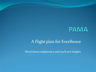
| BEFORE: A text-heavy title-page; the audience may already be asking, “when will it be over?” | AFTER: Jim’s new title page features a dynamic new widescreen template frame. Colorful images help set the stage for a dynamic and engaging presentation ahead. |
Jim Garland is in the business of keeping private jet planes looking their best. But when Jim was called to speak at a luncheon meeting of the “Professional Aviation Maintenance Association,” his PowerPoint presentation looked more like a dilapidated old propeller plane wasting away in the hangar. So Jim called on Kevin Lerner of The Presentation Team for presentation salvation.
“I need to this presentation to look as good as my airplanes,” the 50-year old businessman decreed. “It’s an inspirational talk, and my visuals are hardly inspiring.”
The foundation of a fresh new presentation: Template created in Adobe Photoshop
 |
| Bold type and a sharp image of a mechanic (reflective of the audience) helped drive the accent the point of this slide: You control your attitude! |
Lerner started his presentation makeover with an overhaul of Jim’s basic PowerPoint template, an ordinary white background Office theme with teal curves at the top. Working in Adobe Photoshop, Lerner created a 1920×1200 16:10 widescreen document featuring a bold navy-blue-bordered 150-pixel wide frame. Inside this frame, Lerner envisioned, would be graphics related to the key messages of Jim’s talk, to be inserted as background images in PowerPoint. The blue frame was saved as a .png document, and imported into PowerPoint. Back in PowerPoint, Lerner inserted Jim’s company logo and his website URL at the top of the frame template. At the bottom, a simple branding tagline tied the presentation concepts together.
The frame-style template provided the flexibility to integrate many full-screen images while maintaining a consistent look and feel. But for the basic slides without visuals, and for the master layout, Lerner designed a background slide featuring a subtle light-blue starburst emanating from the center.
PowerPoint “Theme” standardizes fonts, colors, and animation
Jim’s original presentation featured titles of various sizes and fonts jumping around the page. By creating several “PowerPoint Layouts” and creating consistent colors and fonts in this custom “PowerPoint Theme” Lerner was able to reign-in many of the titles for consistency and stability. Calibri was the original presentation’s title font; Constantia for the body. For the makeover, Lerner used a no-nonsense “Rockwell” font, which projects well in large group settings.
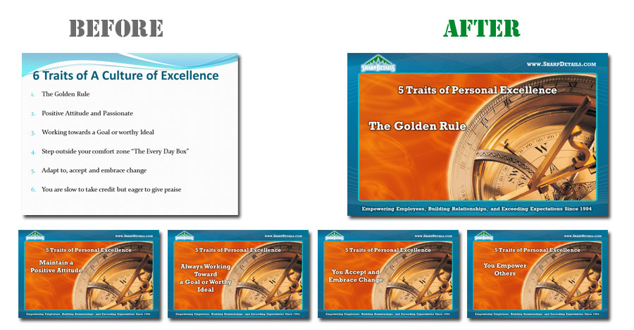
One of the killer culprit’s of Garland’s presentation was his bullet points. Plenty of them. An increasing number of designers are creating presentations “Beyond Bullet Points,” and Lerner’s design philosophy is “one message per page.” So for Jim’s “Five Traits of Personal Excellence” slide, Lerner expanded the slide into five individual pages, with a consistent background. Each page had its own key message with a prominent font.

Subtle transitions and clean animation added style and panache to the slides. After several practice-runs and rehearsals (always vital for any speaker!) Jim delivered his Flight Plan for Excellence presentation to rousing applause. His inspiring message of triumph and perseverance supported by powerful presentation visuals, Jim’s PowerPoint presentation reflects the “Sharp Details” of his planes…and professionalism of a legendary speaker.
Aviation company, Jim Garland, makeover, PowerPoint Design, redesign


