Creating Consistency across many PowerPoint files
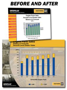
Template and enhanced design delivers a winning series of presentations for national sales meeting

Hawthorne Power Systems is a San Diego based company that builds mobile electric generators for the military and construction industries. The company’s national sales meeting was rapidly approaching, but their PowerPoint presentation was far from ready.
At 280 pages, the presentation was packed with mind-numbing clutter and graphical inconsistencies. So marketing director Wes Campbell engaged The Presentation Team to create a page-for-page enhancement that would improve audience attentiveness and retention.
Our first task was to assess the time (and subsequent costs) involved in undertaking this behemoth project. Just scrolling through the presentation at the rate of one key per second would take nearly five minutes. Since the project was far more textual than graphical, we set a development time “window” of 10 minutes per page plus 20 minutes for designing each of the nine sections’ templates. At that pace, it would take approximately 50 hours to complete the project. And with a deadline just one week away, there was little time for error.
We started the design by creating a fresh new template in Adobe Photoshop. The original template was dominated by a bulky top bar with company logos, and an unnecessary left-side navigation bar. Our new template maintained the Hawthorne brand image and featured a gracefully arcing montage on the left side in place of red menu buttons. We reclaimed some screen space by moving the two logos to the bottom and reducing their size. The top of the template was now freed up for a flat yellow title block area. In the center of each of the nine templates, we placed lightly muted company photos (relevant to the respective section) and overlayed a textured image of arcing lines to convey a feeling of technology, motion, and depth.
We continued the enhancement over multiple passes, first ensuring the typography was consistent and reformatted with Arial (from Times Roman). Then, using guides, grids, and align/distribute, we positioned all the elements to provide uniformity across pages. We relocated the title text from the page body to the top title block. Then tweaked the graphs and tables, eliminating most border lines for a cleaner look and choosing colors that complemented the overall image. To optimize presenter pacing, we used a simple wipe screen transition and eliminated all builds and animation.
Through mindful planning and a focus on efficiency, we crafted a presentation that successfully balanced creativity and quality.
Hawthorne Power Systems, PowerPoint Presentation Designers, presentation makeover


