PowerPoint Redesign: New customer service strategy explained in new presentation.
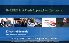
Cox Cable’s new approach to Customer Service explained in a dynamic new PowerPoint presentation.
Design strategy focuses on maintaining company’s brand identity, plus graphical elements of technology and customer service.

PowerPoint Redesign Case Study. In today’s world of instant gratification and online solutions, true person-to-person customer service is a hot commodity! To help executives at Cox Communications understand the value and competitive edge that a fresh approach to customer service would have on business, senior Vice President Kimberly Edmunds developed a 40-minute keynote and first-draft PowerPoint presentation. But Kim’s first draft PowerPoint was heavy on text/bullet points and weak on graphics…so that’s why she called on The Presentation Team!
Our mission: enhance her 30 page PowerPoint with a limited budget and short time-frame. Kim was speaking to over 250 company executives at the company’s Leadership Conference. The visual design needed to be bold, graphical, and easy-to-be-read from the back of the convention room.
Our design strategy focused on creating a look-and-feel that reflected Kim’s professionalism and company’s brand and identity while involving elements of technology and customer service. The 6-hour project involved…
- Development of a custom professional template (title and body masters), that reflects Kim’s professionalism and company brand, while integrating her existing content.
- Re-working the overall look-and-feel of the presentation (colors, fonts, layout) for a more polished look.
- Clean and professional imagery/graphics (portfolio, schematics, people, concept art, etc.).
- Clutter-reducing techniques and presentation strategies to create a “cleaner” look with greater effectiveness.
- Clean and conservative slide transition effects (fades and wipe effect).
- Professional fonts/typography to ensure consistent playback on different computer systems.
- Consulting and collaboration to help Kim to further develop and present new ideas.
 |  |
|
Before: | After: Our makeover included development of a new high-tech blue template in the 16×9 aspect ratio. This widescreen format has become increasingly popular on monitors and laptops and conference room projectors. The body master template integrated colorful and dynamic photos of Cox Cable employees and other customer-related graphics. |
 |  |
| Before: The original slide featured three bullet points to the upper left of the page, leaving the bottom half of the slide blank. The existing stock featured a group of over 15 people from all walks of life…diverse, yet hard to see! The body text was set at 24-point Tahoma with a simple circle bullet point. | After: The revised slide featured a re-worked title in 36-point green serif Garamond Font, bringing a subtle level of class and sophistication. The body text was increased to 32-point Calibri font, and integrated the company’s mascot “Digi” as a bullet point. A simplified photo of just two people helped convey the importance of teamwork in a high-tech environment. |
 |  |
| Before: The need to stop “Feeding the Fish” was a concept that Kim was speaking about. The initial slide featured a photo of a fishtank set inside the template. It was a photo of a photo! | After: We updated the slide with a full-screen version of the fishtank, to provide an “immersive” feeling…as if the slide was the fishtank. Easily accomplished by filling cropping the original photo, right-clicking and “Saving photo as…” and reimporting it to the new slide as a background image. This way the title and master slide elements remained in place. |
 |  |
| Before: Kim was speaking about customer loyalty and featuring information, quotes and statistics from a book. Good stuff for a speaker! The original slide featured a photo of the book centered on the page. | After: Our revised slide featured a quote from the book about “The Holy Grail.” This quote was set against an image of a grail/trophy image…modified in Photoshop to a light blue color. Since the slide didn’t have a title, the dark grey title bar was removed and the text was centered on the screen, supporting the speaker’s key message. The text of “Customers Behaving Loyally” appeared in larger Calibri font, setting it apart from the other lines of text. |
After just three days and three rounds of edits, the presentation was a success! Kim presented to her conference audience to applause and praise, and customer service is better than ever at Cox…in part thanks to a smooth delivery from Kim and great graphics from The Presentation Team!
* The Presentation Team has been creating great PowerPoint visuals for Cox Communications since 2007
Cox Communications, Customer Service, PowerPoint Design, Presentation Sample

