Going Green with a Great Presentation

The inside story of how the energy consulting firm Refined Solar had their bland and boring 32-page PowerPoint presentation transformed into a focused cornerstone of corporate communications for prospective clients and business partners.

Refined Solar may be on the leading edge of renewable energy technologies, but their corporate PowerPoint presentation was far from leading edge. So in February 2010, Refined Solar engaged The Presentation Team to transform their bland and boring 32-page PowerPoint presentation into a focused cornerstone of corporate communications for prospective clients and business partners. The project included content consulting and graphical design through a mix of dynamic, consistent and professional images and layout techniques

The deliverables included:
- Consultation and collaborative development/editing of core presentation content (key messages, bullet points, diagrams, etc.)
- Development of a custom professional template (title and body masters), to reflect the presentation’s content and/or Refined Solar’s brand.
- Establishment of a “presentation palette” defining the colors, fonts, and layout…to make the presentation more memorable.
- Clutter-reducing techniques and presentation strategies to create a clean look with maximum effectiveness.
- Clean and professional slide transition effects (fades and wipes).
- Professional fonts/typography to ensure consistent playback on different operating systems.
- High-impact stock graphics based on the presentation’s content + deep creative/ graphic artistry.
The presentation overhaul started with a fact-finding conversation to define the presentation’s four key objectives:
- Provide a company overview
- Showcase the firm’s products and solutions
- Demonstrate a Return on Investment
- Solidify the next steps and an action plan to savings
And then the 4-phase work project began:
Phase 1
- Template DesignGraphic Look & Feel
- Text Structure / Outline
Phase 2
- Projector/Display Testing
- Interviews and Research
- Content Development / Writing
- Photo Acquisition
Phase 3
- Iterative edits
- Transitions and Animations
Phase 4
- Final Edits/Refinement
- Coaching/Rehearsal
- Testing and Sign-off
The presentation design approach involved:
- Clean and professional imagery/graphics (portfolio, schematics, employees, concept art, etc.).
- Process flow/numeric information and animations (tables, charts, and graphs).
- Improved professional layout/graphics of full-screen graphics.
- Content development and consultation to create core messages, supported by graphics, with an effort to reduce bullet points and text-heavy slides.
- Interactivity (main menu and hyperlinks to jump to key slides and graphics)…providing the presenter with the functionality to quickly jump to key slides, as directed by the viewers/audience.

Our design featured many full-screen graphics saved as 1920×1200 sized JPG images. The images were edited in Photoshop and imported into PowerPoint as background images. This slide used a renewable energy-themed graphic edited from a stock-photo library. To help consistency, we maintained the Calibri font throughout. To emphasize key words, the font was often enlarged or changed to orange.
Don’t just say it…show it! An earlier version of this slide involved a basic boring text list of the company’s affiliations. Our rework focused on making the slide more powerfully and memorable. We created a standard template in Photoshop featuring a solar cell, muted in blue. We saved this template as a background image and imported it as a background image on the body master. We then searched Google for graphics of each of the affiliate logos, importing them and applying a rounded edge and shadow effect.
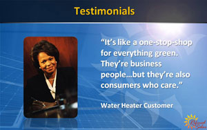
Testimonials are terrific for helping communicate results. People are more likely to believe a statement if it’s given by a 3rd party than directly by the source. In the original version of this slide, three client testimonials were crammed onto one single page with 12-point typeface. Our redesign involved expanding each of those testimonials to its own page, and increasing the font size. It’s better to use actual client headshots/photos…but in this case we used a stock photo.
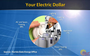
Bye-Bye Miss Ordinary Pie. A flat boring pie-chart was transformed into a 2D chart with images to match the key topics. By converting the pie pieces from flat colors to graphics, the audience could more effectively relate and remember the statistical point.

It’s a powerful statistic…and now it has a powerful supporting graphic. To help communicate the message that a water heater is equivalent to 90 100-watt lightbulbs, we used a full-screen graphic 1920×1200 background image of a row of lightbulbs from a stock library…and then a freestanding PNG graphic of a water heater with a glow effect. The Calibri typeface conveyed consistency, and the key message was emphasized in 40-point type.
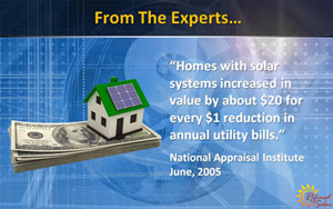
By slightly adapting the background template in Photoshop to add a dollar sign for a financial theme (applied with the blending mode – overlay setting ), we then added a separate PNG of a stock photofeaturing a house on top of a pile of money. The image reinforced the key statistical message of the slide, making the slide more meaningful and memorable.
After 10-days of focused design, the presentation was a hit. Refined Solar now has a refined presentation…and company executives are helping America to “Go Green” with a sharpened message and clean new look.

