PowerPoint Sample: Dynamic PowerPoint Design Showcases Health Beverage
The secrets to transforming a boring and basic PowerPoint design into a high-impact presentation… showcasing for MonaVie’s power drink business potential.

MonaVie is helping people to be healthy…and wealthy. This refreshing beverage integrates the Brazilian açai berry and 18 other body-beneficial fruits from around the world to support a healthy lifestyle. But it’s a much more than just a beverage in a bottle…it’s a money-making enterprise! In April 2009, Michael Murano of Executive Success Team first turned to The Presentation team to transform their boring and basic PowerPoint into a high-impact presentation to showcase the Mona-Vie’s beverages and business.
The presentation’s objectives were twofold: both educational/informational, as well as sales/marketing. It was created to be delivered in person, or online via webinar or webcast. The deliverables included:

- Consultation and collaborative development/editing of core presentation content (key messages, bullet points, diagrams, etc.)
- Development of a custom professional template (title and body masters), to reflect the presentation’s content and/or MonaVie and EST’s brand.
- Establishment of a “presentation palette” defining the colors, fonts, and layout…to make the presentation more memorable.
- Clutter-reducing techniques and presentation strategies to create a clean look with maximum effectiveness.
- Clean and professional slide transition effects (fades and wipes).
- Professional fonts/typography to ensure consistent playback on different operating systems.
The presentation was designed with a clean and contemporary design style integrating positive/motivational imagery featuring diversity while reflecting a professional positive image. Graphics were created to integrate transparencies, motion, and shadows. The Project was contracted as a 40-hour endeavor, with work divided into 4-phases:
| Phase 1 | Phase 2 | Phase 3 | Phase 4 |
|---|---|---|---|
|
|
|
|
Light, Bright Modern Widescreen Template sets the stage for a “fresh” presentation
The widescreen 16×9 template was designed to be clean, light and open, featuring a grey textured background to provide dimension and flow. The green fonts and graphical accents complemented EST’s brand and their website and helped create a consistent look and feel.

One of the early slides (for the live audience presentation version) showcased a friendly message to remind people to shut off their ringer…for a focused and un-interrupted seminar. The graphic featured a clipped PNG Graphic of a cell phone. In Photoshop, we added the “Silence” Message. We selected Optima LT as the primary font. It conveys a clean and professional look, while maintaining a unique and relaxed appearance.
Show it! Antioxidants explained through Food Pyramid Image

To help convey the fundamentals of antioxidants (and its eventual tie-in to MonaVie), The Presentation Team integrated a transparent PNG graphic of the “Food Pyramid” with a short message about the increased need for fruits and vegetables in our diets.
Ditch the template! Full Screen sends a bold message.

To convey the concept of openness, freshness, and good clean living, we integrated a full-screen graphic of a happy healthy family. Bullet points were minimized in text and offset to the left of the graphic. To maintain consistency and unity throughout the presentation, we kept the bottom green arc and logo in place together with the Optima font.
The Need…and the Solution.

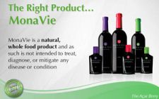
After creating the “burning platform” of the importance of antioxidants in our lives, the “right product” of MonaVie makes a grand and colorful appearance as a transparent PNG graphic off-set to the right of the text. Key words appear in bold Optima font.
There’s still value to Vector Clip-Art

Many designers have opted to integrate the more realistic and dimensional “stock photograph” for the two-dimensional and illustrative “clip-art.” But there is a value for clip art, especially when dealing with diversity. An illustrated group of people can help convey diversity without divisiveness. In this presentation slide for EST, the clip-art people add a generic human element to support the “Am I Ready” business message…without pigeonholing the viewer into connecting with a specific person on screen. It’s generic yet inviting, creating an image that everyone can relate to.
After 2 weeks of collaborative development, a winning presentation finally emerged. Michael Murano of Executive Success Team now has a winning presentation…and his MonaVie associates/downline are helping America to live healthy…while making money!
design, Executive Success Team, Graphics, Marketing, Michael Murano, MonaVie, Multi Level Marketing, powerpoint, PPTX, presentation, sales

