Presentation trends to excite and unite

Emerging trends, technologies, and techniques in the presentation industry.
The presentation of presentations has evolved radically and rapidly. Not too long ago, overhead transparencies and 35mm slides were the trendy tools. More recently, projectors and computer-based presentations have taken center-stage.
But the most exciting presentation products are on the horizon, as increased bandwidth, more powerful and compact technologies, and a more technically-savvy consumer merge to pave a path for clearer communications.
Virtually speaking: webinars and online presentations transform the meeting industry

Budgets for company conferences and regional meetings are being slashed universally, as budget-conscious managers turn to the Webinar as a fast and economical method for presenting information. Even the terms webinar and webcast has become interchangeable with presentation: “I need to give a webinar.”
Thanks to faster graphics cards, more powerful processors, and greater bandwidth capable of displaying a PowerPoint presentation plus a live video of a speaker and high quality audio, webinars are taking center stage. Thanks to faster graphics cards, more powerful processors, and greater bandwidth capable of displaying a PowerPoint presentation plus a live video of a speaker and high quality audio, webinars are taking center stage.
“People are becoming more comfortable with webinars and recorded presentations,” explains Ken Molay, an online communications strategist based in North Carolina. He says while everyone agrees that the numbers of webinars and recorded presentations are increasing, it’s difficult to get an actual estimate on statistics and true numbers
Indeed, several larger companies have pulled the plug on their face-to-face regional meetings. One marketing executive at ADT/Tyco in Boca Raton speculates the security giant saved $1,000,000 by conducting a recent regional meeting online.
But delivering an effective webcast is a whole lot more than just a few bullet points and a pleasant template. Presenters are going to great lengths these days to create web-based presentations that captivate and inspire. More compelling graphics, dynamic animation, and concise text points are all focused on keeping an audience engaged.
Future webcasts will likely bridge the gap between reality and virtual reality, as the size and resolution of display monitors increase, providing for greater involvement and virtual integration of audiences. High definition video, 3D rendering, and a more robust and integrated Web 2.0 will eventually provide for a more dimensional and involved presentation experience …delivering more results and greater success to presenters and their audiences.
Webcastaways: the real deal.
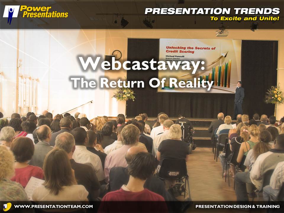
Despite the popularity and appeal of webcasts and webinars, many managers and professionals still view the web-based presentation as a novelty. They say there’s simply no substitute for a presentation delivered face-to-face to a live and engaged audience.
Many experienced business professionals say that webcast audiences simply don’t take webcasts as seriously as a during a live meeting. Participants are multitasking maniacs, dividing their attention between texting, chatting, and other work. And, unlike a live meeting, a webcast is a two-dimensional experience. Presenters complain of a lack the feedback from their audience. A digital happy face or frown is no substitute for the complexity of human emotion that can be conveyed face-to-face.
Jay Forte, a business consultant and speaker believes the meeting industry will rebound from this downturn with a sharpened and renewed focus on the value of a live presentation.
“The industry is committed to results. Regardless of efficiencies developed through technology, face-to-face interactive presentations continue to be the most effective way to influence behavior change, share an important message and activate performance. Live meetings continue to offer the greatest return on presentation investment because they are more personal, interactive and customized; they more consistently connect with and engage an audience,” explains Forte.
Experts say that face-to-face networking is also sacrificed in webcasts. Participants at live conferences have the opportunity to meet others with common interests and similar backgrounds…for mentoring, strategies, commerce, or simply friendship.
Management is recognizing the value of webcasts, but also the inherent limitations. Despite the technological triumphs of webcasts, most experts agree that the live meeting will experience a renaissance and resurgence.
16:9 aspect ratio has wide appeal

We have seen the future, and it is here: a recent study confirmed that all new computers for sale on the market today- Mac or PC – are able to display at the high-definition widescreen format of 1920×1200. The human eye layout (left and right) comfortably and easily adapts to this increasingly popular 16:9 aspect ratio. But the typical PowerPoint presentation has not caught up to ubiquity of this format…seen on nearly all new monitors and plasma televisions sold today.
As the older 4:3 diminishes, and people reduce their use of paper-based presentations (8.5″ x 11″) paper-based presentations, the 16:9 widescreen will quickly and formidably transform the presentation industry. Convention planners are already designing meeting sets in wide-screen format. Conference rooms are being designed with large widescreen monitors on the walls.
The increased popularity of 16:9 screen plasma monitors are forcing presenters and speakers to either suffer and watch their 4:3 formatted presentation distorted and stretched to fit, or placed in the center of the screen, sacrificing up to 20% of valuable screen real-estate to empty black borders.
With a few quick edits in PowerPoint or Keynote – or by starting these presentations off in the widescreen format- presenters are giving their presentations wide appeal.
Presentations on the go: smartphones deliver ovations!
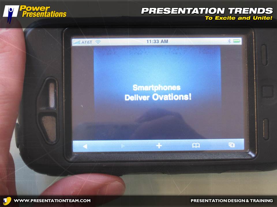
More and more people are using their Blackberries, iPhones, and Smartphones as presentation tools. Videos and PowerPoint presentations reformatted for the small screen are empowering presenters to share their message wherever and whenever. The convenience of a brief presentation, formatted for the iPhone that helps support your message can be very powerful to make your message more memorable when you need to inform, inspire or motivate. Whether the presentation is stored locally, or streamed from a website, the smartphone is another new weapon for making a mark in the presentation industry.
The iPad: The Perfect Ppresentation Product
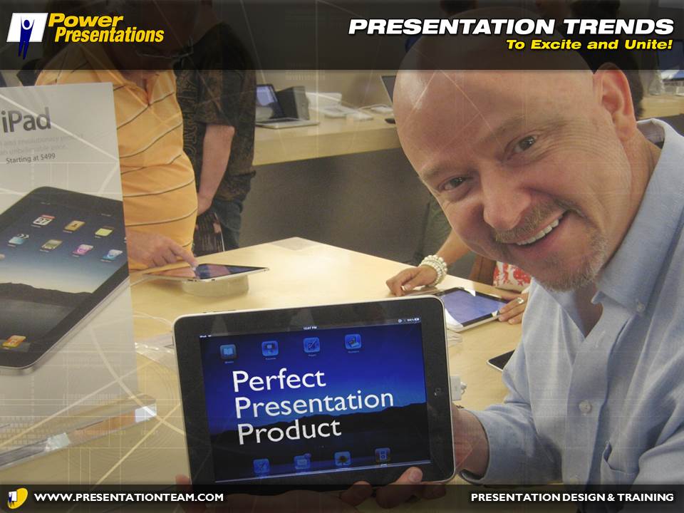
Apple’s new iPad has transformed the way the world presents…overnight. Some sales managers are buying them en-masse, to distribute to their armies of sales professionals. Just hours after Apple announced their new “magical and revolutionary” iPad, presentation and training industry experts were proclaiming that this simple yet sophisticated product would change the presentation market.
On the surface, delivering your message from an iPad sends a message of technological savvy and sophistication…affluence, and hipness. Apple’s Keynote software already has a perceived edge over PowerPoint for effects, power, and elegant simplicity. The iPad allows these Keynote (and PowerPoint) presentations to be shown easily and simply…delivering the outside world – your presentation – to your viewer in a face-to-face and interactive approach. A well-designed presentation with text, graphics, video, audio, and interactivity – delivered by a qualified professional on a new iPad – is sure to win new clients and close more sales.
Cloudware creates virtual presentations
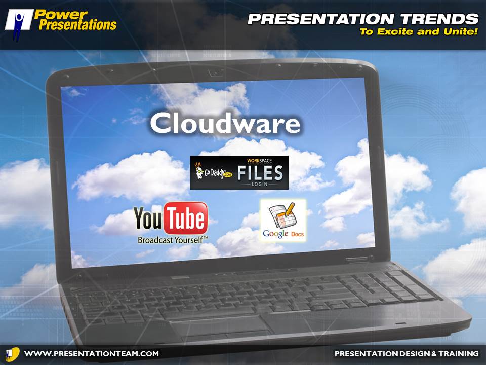
I was recently at a friend’s house on a Saturday night and I wanted to share a presentation I designed, but I didn’t have my laptop with me. So using his laptop, we went to SlideShare.com and easily and instantly accessed my library of presentations. With a few quick clicks, we were watching my presentation through this virtual reality technology commonly referred to as “cloudware.”
Increasingly, people are leveraging the connectivity of the internet to share files, connect, and move beyond the limitations of their laptops. More presentations are being uploaded online to private file sharing sites, or shared on systems like SlideShare or YouTube.
Open Source presentation software that’s compatible with PowerPoint is making its mark, as Google Docs’ Presentations becomes increasingly popular and easy to use. Another product with big financial backing is a SlideRocket, a web-based presentation design tool that touts its simplicity and power.
The delivery and design of presentations using cloudware (online) is gaining in popularity. Users are becoming more comfortable with the ease of access, file sharing, distribution, and growing number of features and functions that “cloudware presentations” provide. It remains to be seen whether presentations in the future will be created using server-based technology – most corporations still want to keep their software local – but future presentations will increasing be presented in the clouds.
Movement captures our attention: Amped-up animation and video
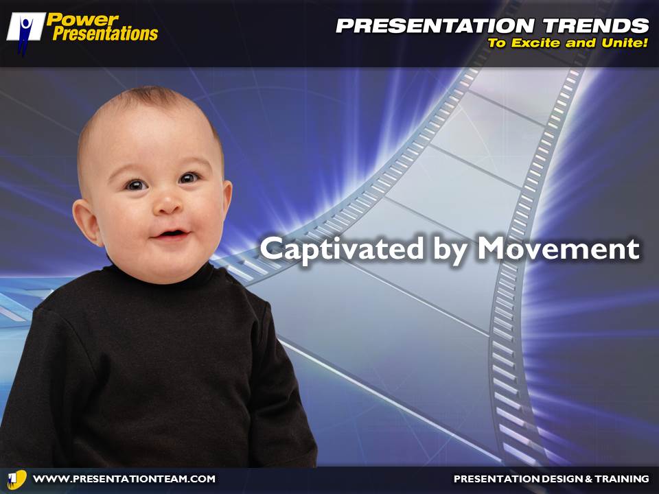
From our earliest days as infants, we have been captivated by movement. Our eyes fixate on items in motion. As business presenters search for secrets to capture their audience’s attention and make a greater impact, the need for amped-up animated slides is increasing.
Be on the lookout for video background templates, the next big wave to hit PowerPoint in the coming months. Rumor has it that the new version of PowerPoint 2010 will support (and include) motion backgrounds. Presentation visuals will likely adapt motion and imagery similar to a newscast’s images. Elegant but animated flying titles will become the in-thing as presenters strive to maintain their audiences’ attention.
Thanks to increases in technology, bandwidth, and software proficiency, presenters will have more tools at their fingertips to create presentations that help communicate the message through 3D rendered animated examples. Videos will easily bring the outside world to the inside audience. And simple screen transitions and text animations will provide subtle eye candy to make presentations more fun and engaging.
The collapse of clip art and rise of reality photos
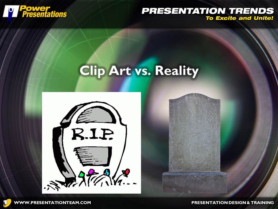
If you’re a graphic illustrator, chances are you’re having a tough time keeping busy. Most professional presentations these days graphics are using photographs and 3D imagery rather than vector-based clip-art. This illustrative format (.WMF, .EPS, .AI) was the in-thing just a few years ago. The file size was small, the elements were editable, and the style was cute and comfortable. Collections of clip-art flooded the market. First 10,000. Then 50,000. Then 500,000-piece collections.
But in recent years, people have rebelled against clip art, looking to the more sleek and stylish stock photo for added flair and impact. Websites like iStockPhoto.com and photos2go.com have helped raise the bar for trendy presentation design, delivering contemporary photographic images that inspire and delight.
Still, illustrative art is far from dead, as avatars and comic-book-style action characters make a resurgence. A recent presentation for Cox Communications that I helped develop included a 3D cartoon character – “Digi” – whose role was to help commuicate key messages home to the audience.
Dynamic photos and clipped images have ushered in a wave of modernism and “reality” to presentations, helping to create a look and feel that audience members can connect with. Presentation designers are reaching deeper into their stock photo libraries to find appropriate images, or creating images in Photoshop.
Bigger presentations are going a step further to create a “reality-TV” look by making their team the stars of the presentation with team photos and imagery direct from the field. With the increased popularity of digital cameras and smartphones, anyone can take a photo and integrate it into a presentation to help drive the message home.
Let there be light: the bright idea about backgrounds
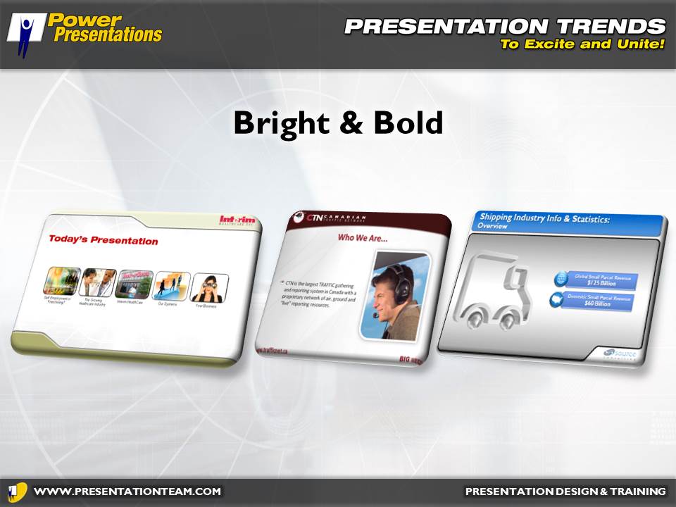
When I first started creating presentations in the early 1990s, I read articles and saw examples of slides with light white text dark set against blue gradient backgrounds. Scientific studies emphasized that the human mind can comprehend information easier if its set against dark background. Moreover, the projection technology of the time (35mm slides and first-generation 3-color video projectors) showcased the sleek appeal and striking contrast of a presentation with a dark background.
But in recent years, the trend has turned and presenters are getting a bright idea, by using a lighter background with darker text. Presenters and designers say the lighter look is fresher, relaxed, and newer, sending a subconscious message of openness, ease, and flow. Additionally, a light textured background also works easier when a presentation needs to be printed, as no colors need to be converted; the background can be just turned off. The bottom line: projection technology has advanced considerably. When designing a presentation, feel the mood and explore the impact that the audience or event is meant to be conveying.
Bullets Bite the Dust

We’ve all seen our share of horrible slides crammed with bullet points. Speakers dumping their entire speech onto a few pages…and then reading it to their audience. In more recent times, companies like Apple have been pushing the beautiful brilliance of simplicity in presentation design. And it’s working. An increasing number of presentations are indeed appearing shorter and succinct. Small headlines. Brief bullets. Graphics that tell the story.
Perhaps it’s tools like Twitter that’s awakening people to the power of a short focused headline. Perhaps it’s the realization that more slides doesn’t always mean more time or money and it’s okay to split points across multiple pages. Perhaps it’s simply the web working to share the gospel of a good presentation design.
Robert Swanwick runs Speaker Interactive, and online media product for speakers bureaus to supplement their in-person speaker offerings. He says he’s pleased that people are biting the bullet, but is most excited about the multi-dimensional approach of the next generation of presentation tools. “The upcoming set of presentation tools that are gaining traction now create a large canvas where you can build zoom points. This is quite a distance from today’s PPT which is basically a set of disconnected rectangles,” explains Swanwick. He says that tag clouds – a weighted list in visual design – are making their way into presentations as a more accepted and non-linear navigation and communication.
We have a long way to go before the majority of the world knows what it takes to create a good clean presentation. But maybe- just maybe – we’re making inroads into the concept of “less is more.”
Shining a light on smaller, brighter, and economical projectors

Compact, lightweight and super mobile, an increasing number of pocket-sized microprojectors are shining a bright light of opportunity for people wanting to present or share digital content on-the-move. These micro projectors are LED-driven devices that offers full VGA resolution connectivity to a range of multimedia devices. The higher end models contain SD card readers, to display presentations or images on the go. AC or battery-powered, these micro projectors are fast and easy ways to get your presentation projected in a compact area. They’re priced from $150.
Prices and size continue to drop for DLP and LCD projectors, as their functionality and brightness continues to climb. HD projectors are increasingly visible, delivering theater-like quality in a shoebox size powerhouse. Brighter and sharper output are making the future of presentations powerful and potent.
Exciting tools are on the horizon. But regardless of the medium and technology, the key to a successful presentation is still the presenter. And sometimes less is more.
Future of Presentations, PowerPoint 2010, Presentation Trends


