No-Nonsense Template Delivers Consistent Theme to Multiple Presentations

A 547-page presentation makeover made easy…thanks to a template master and thoughtful planning.
The inside story of how environmental conference organizers transformed 22 separate PowerPoint to a unified look and feel.

The American Water Resources Association’s conference on “Restoring the Everglades” features several breakout sessions and speeches from scientists and engineers from around the world. While organizing this annual event, conference management sought to create a “brand image” of the event. The organizers hired The Presentation Team, to give a series of 22 slideshow presentations a consistent look and feel. All together we had to re-work 547 slides. With less than three weeks for the makeover, the project was a tall order, especially since each slideshow was created by a different presenter.
We began by communicating with each slideshow creator the process and deadline for submitting materials. We then turned to Adobe Photoshop to create a template based on its modern look, subtle integration of the conference’s logo and its flexibility of title and body space. The template JPG file was moved into PowerPoint, and set as the background choice for the slides. Within the master layout we then standardized fonts, colors, logos and page layout, and saved as a .pot (Template) file. By applying the .pot template file to 22 presentations, each presentation quickly and easily conformed to a standard look and feel that helped convey a message of unity and consistency through the convention.
 |  |
|
Before: | After: The titles of the images have been moved to the top and we have increased the size of both the body text and the headline. We changed the font to make it more readable for a large audience. |
 |  |
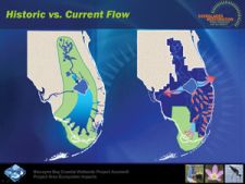
| Before: This modern-day photograph compares the water flow of the Everglades against the historic flow. But this comparison does not clearly illustrate the historical context. | After: We moved the historic flow to the left side of the slide and created a new illustration to show the current flow. The addition of the red arrows places the audience’s attention on the point of the comparison – that changes in water flow are affecting the Everglades. |
 |
 |
|
Before: |
After: |
The final step was to work with all the presenters over the three days leading up to the conference, to tweak and edit their presentations in rehearsal. Through thoughtful planning, file management and communication, this large job quickly became a seamless presentation experience for the audience and it supported the overall goals of the conference. The Everglades is staying clean thanks in part to the clear communications and great visuals from The Presentation Team!


