Finding True Love…with a Beautiful PowerPoint Presentation
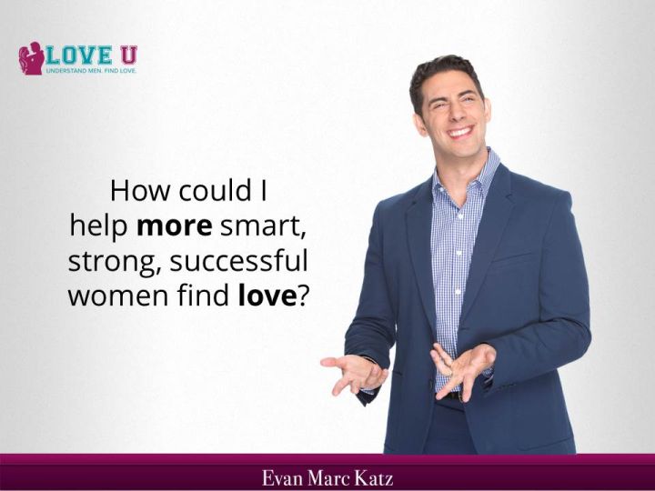
Dating guru Evan Marc Katz hires The Presentation Team to create a dynamic 150 page webinar presentation to launch his new dating program, Love U.
Coaching presentation developed in 7 days; re-worked from previous design agency.
When Evan Marc Katz called, he was in a panic. “My webinar is in less than a week and the PowerPoint is awful.”
Yes it was. “This is not me!” he insisted. His presentation- created by a low-cost overseas design agency- was littered with formatting inconsistencies, low-resolution clip art, and over 400-pages of bland bullets and spelling errors. I reviewed his website, asked a few clarifying questions, pitched an agreeable price, and got to work on creating a fresh presentation focused on helping him launch his new Love U web-based dating service.
Evan Marc Katz is a modern-day pricing charming, helping deliver dream-men to women through sage advice, inspirational messages, and modern-day magic. With a long-list of recommendations, accolades, and online following, his track record and reputation is respected in the dating circles. But these days, Katz is in high demand. So he worked with colleagues over the past year to create Love U, a self-paced romance/dating training system. Katz promises that- if followed- Love U will help deliver the “man of your dreams.”
Design to match the brand with a fresh, friendly, and warm image
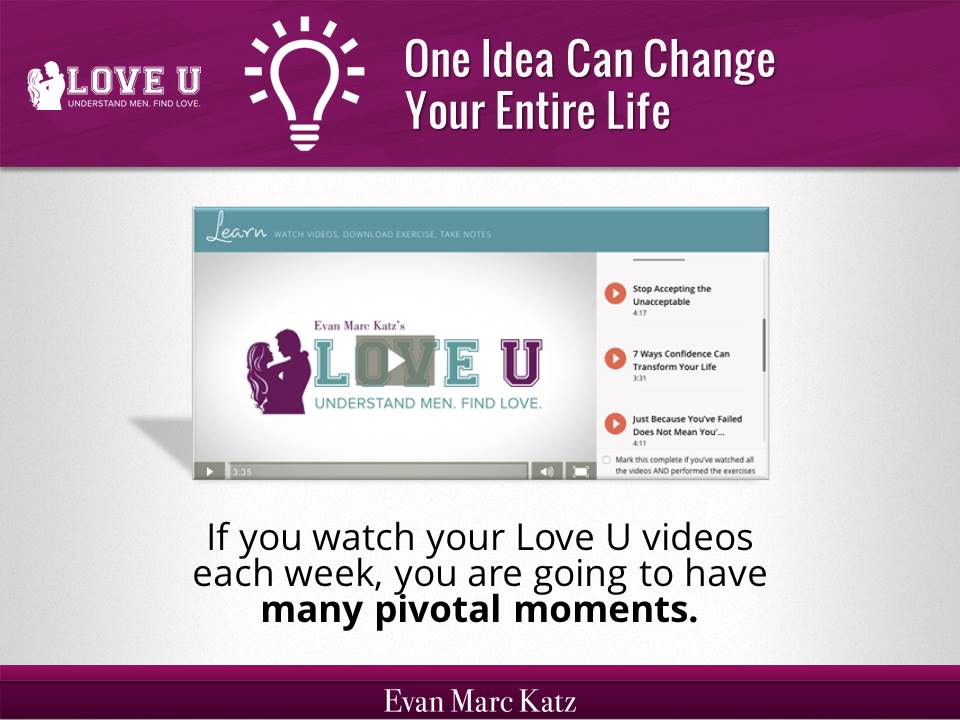
Katz is proud and protective of his brand. Before starting the presentation, we created a template reflective of his image, including fonts, colors, and graphical elements all used in his existing marketing material. In addition to sharing screen shots of his colorful Love U website, we designed the presentation to display data through a series of techniques:
- Healthy white space between bullets and objects; at least 1″ margins on left and right.
- Where possible, words and companies replaced with icons and logos.
- Freestanding elements integrated into rectangles for unity and visualized grouping.
- Hair-thin skinny lines replaced with heavier lines for visual prominence.
- Section slides added to create improved flow and comprehension to message.
The 10 colors of the template Theme included 4 shades of purple (light to dark), plus the 3 colors of Love U’s logo; teal, white, and black. It may seem limited, but the colors created unity and consistency through the presentation.
The background was a light-to-medium-light-grey texture to give depth and dimension from the original flat-white background.
And the fonts were defined in the Slide Theme as Oswald (for Headings) and Open Sans (for body). These fonts projected a level of conservative strength, level of unique freshness, and effectiveness for easy viewing in webinars.
Reduced text + screen shots for supporting information.

Like most great presenters, Katz knew that he is the start of his presentation…not his PowerPoint. So we worked to reduce the text-heavy bullets, and emphasize key words of action and benefits. His first live presentation had several hundred atendees. After the second live webcast presentation, Katz recorded the 60-minute program for on-demand playback.
A Call to Action

Like most great sales pros, Evan wastes no time in asking for the order. A good portion of the presentation was spent showcasing the benefits of his Love U program, as well as encouraging participants to take action.
Evan Marc Katz’ Love U presentation is a case study in balancing creative presentation design and clear content with efficient development. Time and costs were controlled, but everyone worked efficiently within the scope to meet the needs and create a dynamic presentation…that’s online now and helping women to find true love.
evan mark katz, love, makeover, powerpoint, powerpoint makeover, redesign

