10 Tips for Using Fonts in PowerPoint
Make your presentation Fontastic with these 10 Tips…
Next to graphics, type and fonts are the most effective way for communicating your message. Fonts add emotion and impact to your presentation. They also can create variety and help to keep the attention of your audience. Here are 10 tips for using fonts in your next presentation…
PowerPoint Font Tip #1: Include/Embed Your Fonts.
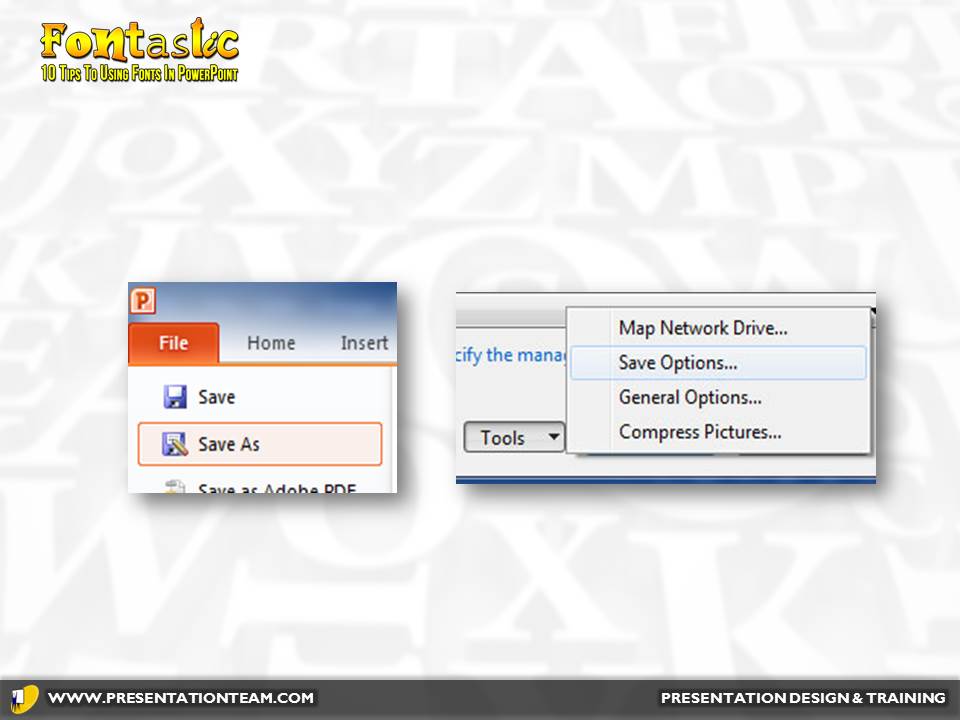
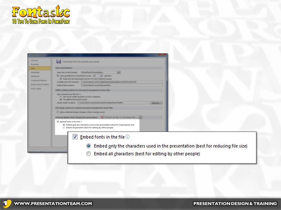
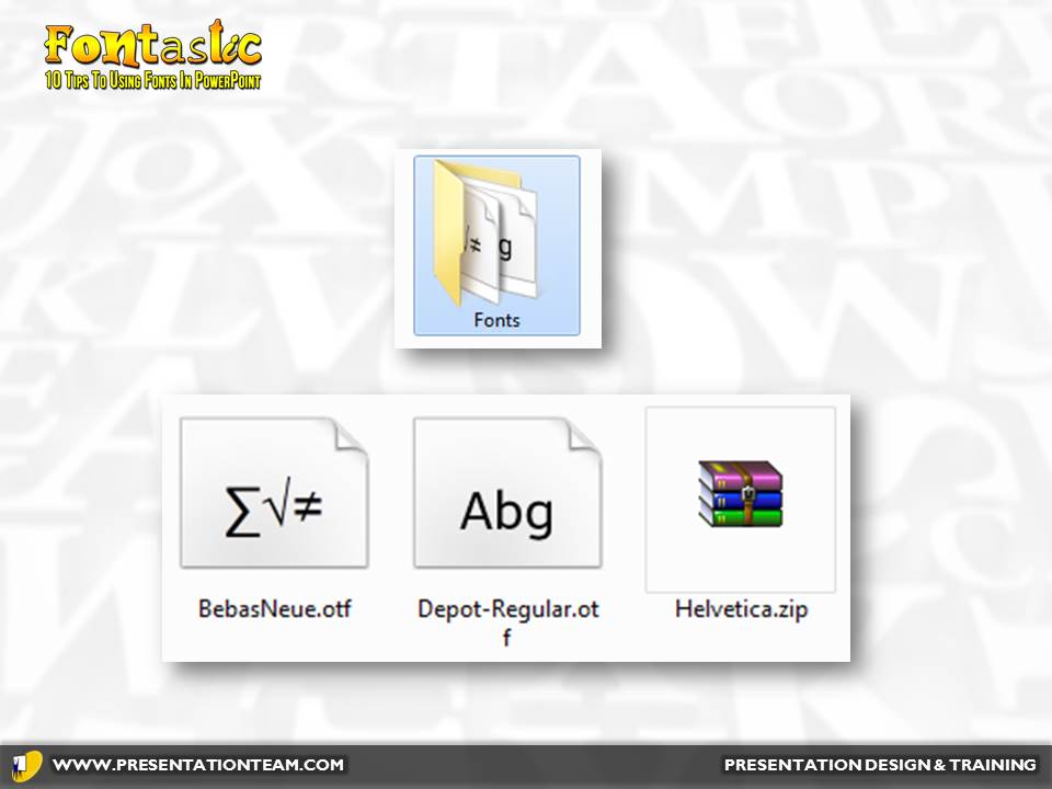
If you don’t save your presentation with the fonts, the end computer may substitute a default font that could destroy the perfect presentation you’ve created. As an added safety factor, distribute or copy/save the actual font files (.ttf/.otf) together with your presentation (below).
#2 Employ weight contrast for visual interest.
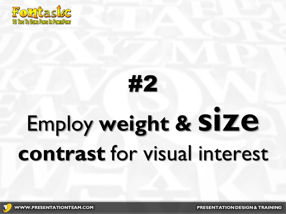
You can draw attention to key points on a slide by emphasizing key words in boldface, or in a larger typesize. Just a subtle change in size can increase visual variety and interest in your presentation, while emphasizing the key takeaway messages.


#3 Check out www.google.com/fonts
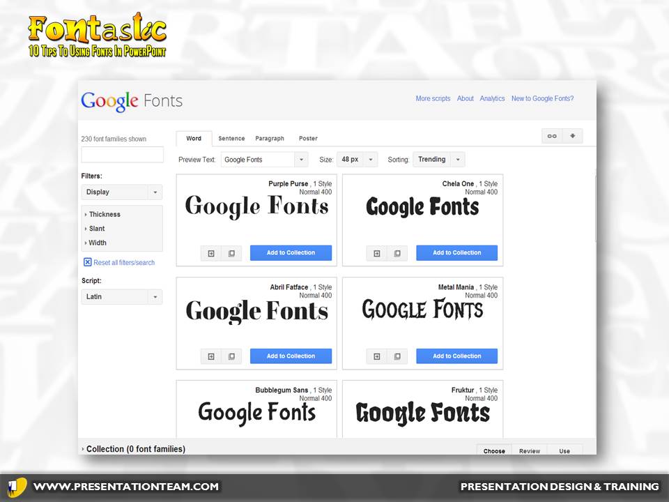
This free site by Google is loaded with over 300 Open Type fonts (OTF) typefaces. The fonts are organized by style, with examples. They’re easy to download, install and integrate into PowerPoint. OTF fonts are cross-platform, so they’ll work well on Windows or Mac if you’re using Keynote.
#4 Limit Serif Fonts to Headlines.
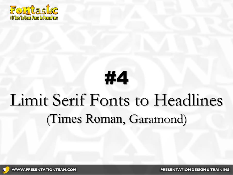
Fonts like Times Roman, Garamond often look busy on screen. The “Serifs” (frills) on the edges of the fonts help guide the eye along on paper. But when projected, smaller serif fonts often blend together and look cluttered. Instead, use Sans Serif fonts like Arial, Helvetica. These are easier to read when projected.

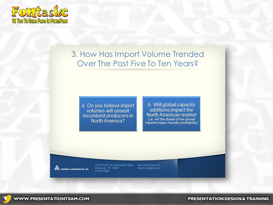
An example of a presentation with a headline in Garamond (Serif) vs. Century Gothic (Sans Serif).
#5. Avoid High Tech and Modern Typefaces
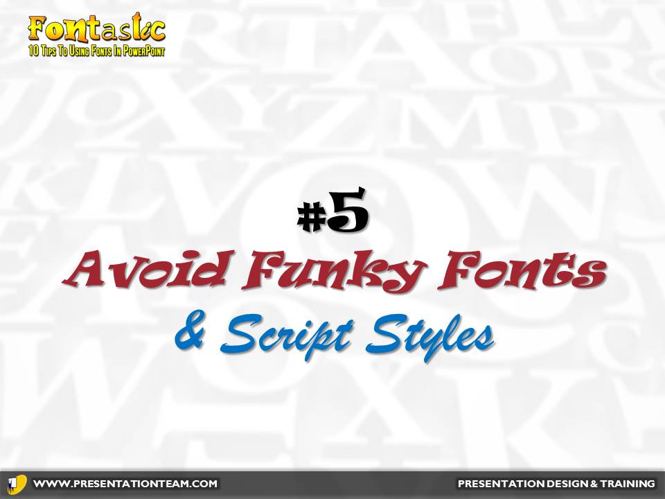
Modern fonts may look cool, but they’re difficult to read and detract from the message. They may be okay for the opening slide, but audiences will grow tired of them if they’re forced to read lots of text.
Script-based fonts are hard to read are best used sparingly on one or two words, or to send an informal image.
#6: Investigate Slab Serif Typefaces
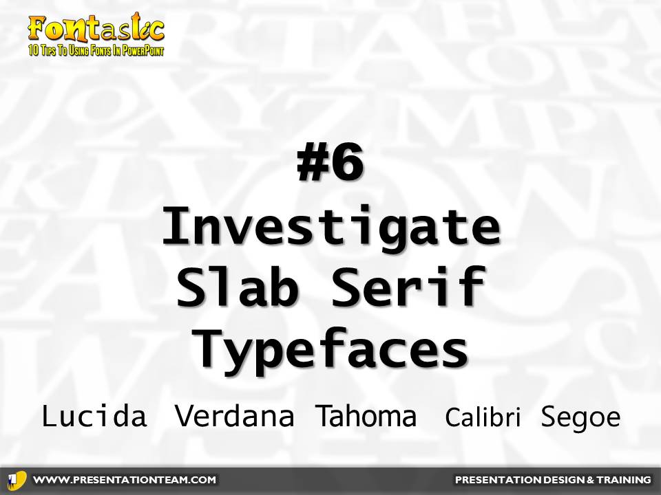
Often overlooked, these sturdy fonts- Lucida, Verdana, Tahoma, Calibri, and Segoe- reflect a no-nonsense feeling of strength and contemporary design. They hold up well when projected and help promote a feeling of fresh design to any presentation.
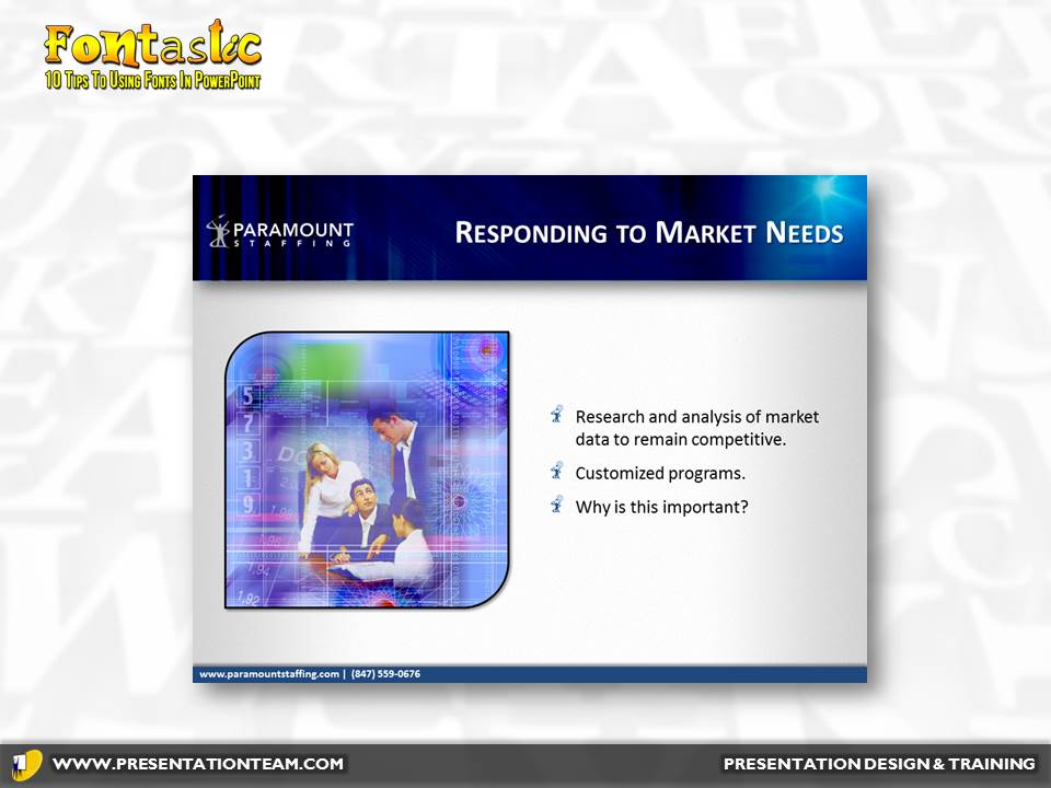
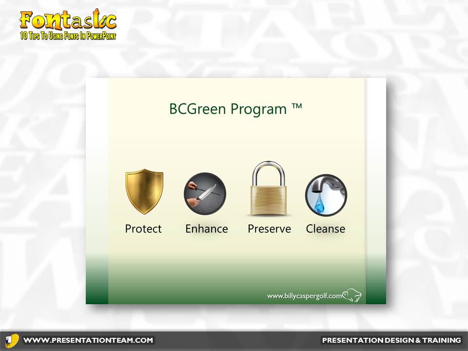
Two presentations using Slab Serif fonts.
#7: Define your fonts in your Theme or Master.
Most people work with templates for efficient and pre-set layouts for text and images. But a template can also have pre-defined fonts…for the title and body of a slide. Collectively, preset fonts, colors and templates/layouts are called “Themes”. By using preset fonts, it’s fast and easy to change the overall look and font of a presentation instantly!
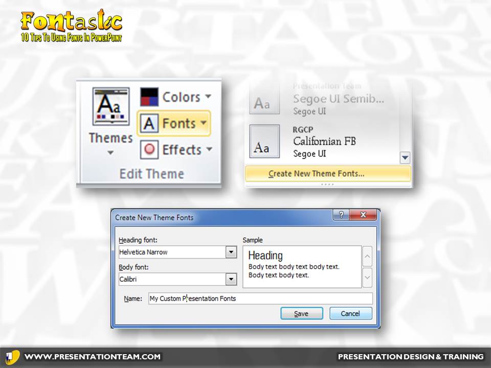
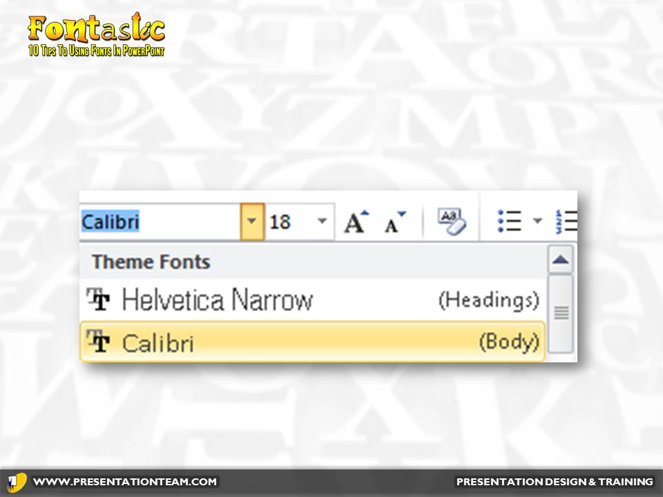
Steps to take to define your fonts in your PowerPoint’s theme.
#8: Maintain maximum foreground/ background contrast.
Be sure there is sufficient difference in tonal value between type and the background it appears against. The majority of presentations these days use a lighter background, so having a darker font is helpful…especially if you’re going to print the presentation.
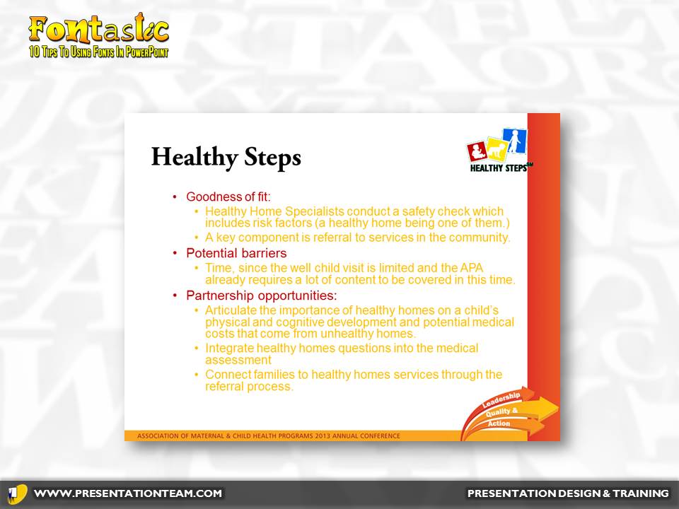
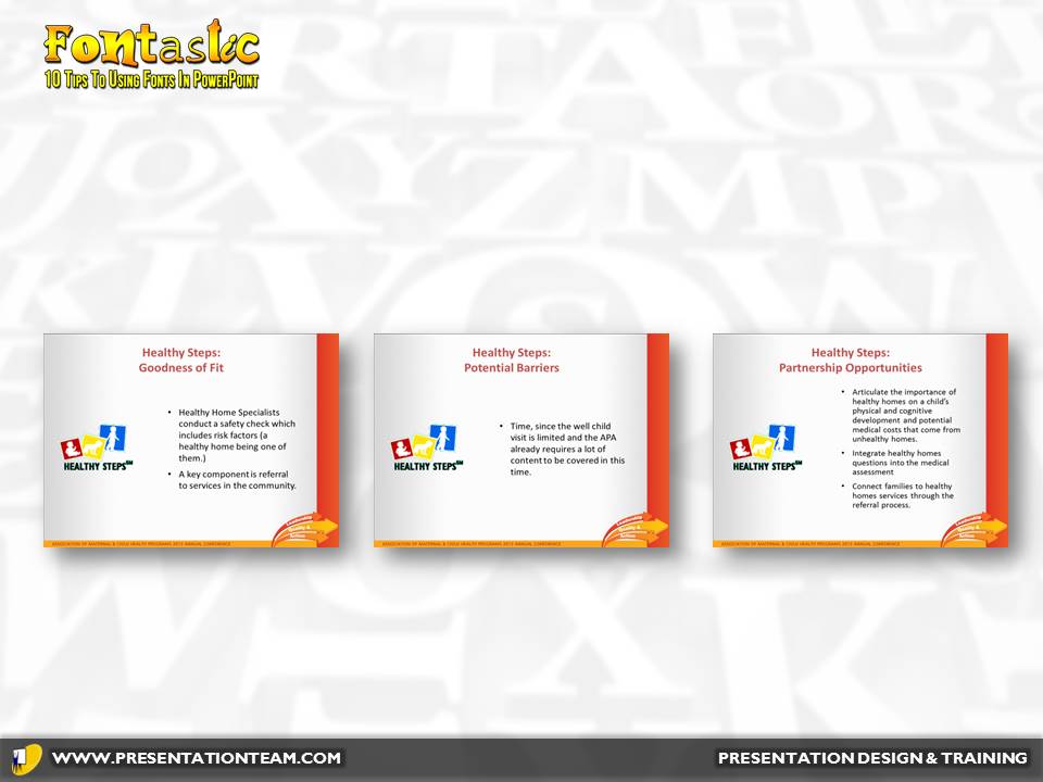
Examples of yellow type against a white background. The revised option has the text converted to black and spanned across 3 pages for easy readability.
#9: USE CAPITALIZATION WITH CARE.
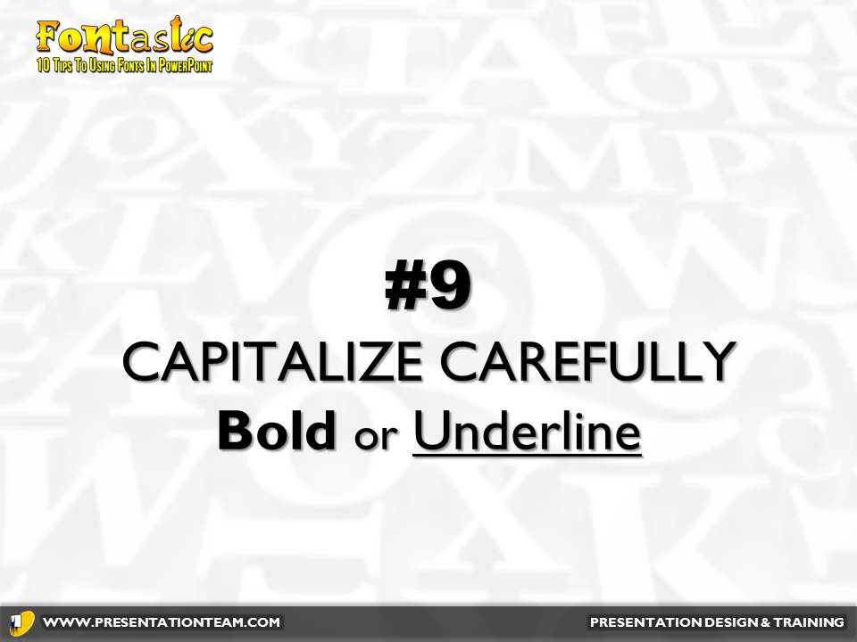
Capitalizing makes letters harder to read and takes up more space. They maybe okay for titles, but it’s better to emphasize with Bold, Underline, or a larger font-size.


The key words “deserve” and “negotiate” stand-out because of the bold and underline. (Not to mention they’re not all capitalized!)
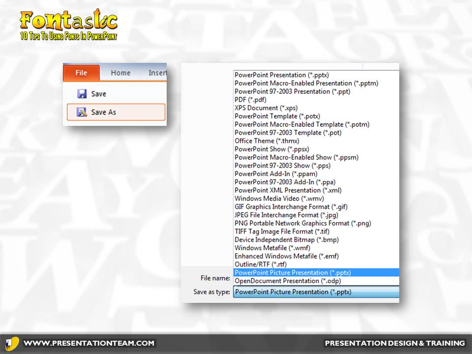
#10: Save as a PowerPoint picture presentation.
By saving your presentation as a series of jpg photos (File…Save As…JPG), you can be assured of a “What You See is What Your Get” presentation. All the slides will convert to graphics- rendering them uneditable and will destroy any animations- but any concern of incompatibilities with typefaces will be gone. This works great for systems like SlideShare.net, where many typefaces are often downsized to a basic Arial or Times Roman font. If you don’t have the time to test the presentation on the end computer (which will guarantee it looks the same as on your computer!) this is a great way to make sure it looks great.
Fonts are not just words! They’re graphical elements that can convey meaning and emotion to your presentation, making it more memorable and meaningful. By taking the time to build a library of typefaces and fonts, you can help build presentations of intrigue and impact.
best, best fonts for powerpoint, font, how to pick fonts, powerpoint, ppt, Presentation fonts, typefaces, usage


