Secrets to Writing Great Headlines and Brief Bullets in PowerPoint
PowerPoint Users: Discover how to write headlines beyond flat fragments of fluff and boring bullets of blah for maximum presentation impact and authority.
Ha! You’re looking at this article! Chances are it was because of a compelling headline. Our eyes are naturally drawn to words of intrigue and curiosity. A title of “PowerPoint headline and bullet writing” might not have been as compelling. Headlines and bullets- whether in PowerPoint, Keynote, or Prezi- should hold that same eye-catching intrigue if you’re looking for you and your presentations to stand-out and be remembered.
1. Listen & Look
There are great examples of headlines all around us in all mediums; succulent enticing text that compel us to tune-in, read-on, or click here. Pay attention to the topics that grab you…and aim for the same attention-getting power in your presentation headlines. It may seem corny at first, but you’ll soon see more heads looking at you and the screen, than down looking at their cell phone or clock.
2. Think like a Tweeter

Twitter is a great tool to gain insights into headline writing; short simple statements of intrigue in under 160 characters. Adopt a similar strategy, aiming for fewer than 10 words in your presentation headlines.
3. A Head-Turning Headline: Catchy, Curious, & Compelling
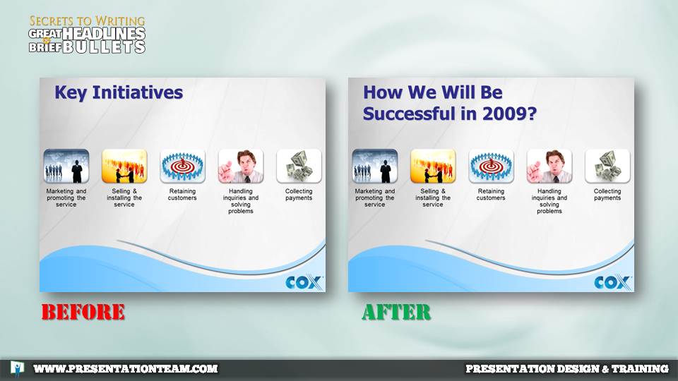
When building a presentation, it maybe helpful to write-out a title that’s a simple basic fragmented sentence, or just a few words. But head-turning titles are Catchy, Curious and Compelling. They catch your eye, making you think and compelling you to want to know more.
Ask a question. Write a provocative statement. Tell them why they should listen or read-on. Short conversational words are best, eliminating any jargon or ambiguity. The headline can either stand-alone, or be supported by bullets and/or graphics.
4. Write Like an SEO Guru

Presentation headlines should be written similar to how a website blog headline would be written: a short, compelling statement aimed at generating clicks and readership. For presentations, aim to answer the viewer’s underlying interest in solving a problem or getting more information. Or – as in the case above- work to consolidate the top-level bullet with the headline.
Ask yourself: “If someone in my audience was searching for this slide, what would they search for?” Write your headline with that search concept in mind with fundamental keywords in the title.
This is especially helpful if you’re creating a presentation for an external audience, and placing the presentation online. Your presentation will have a good chance of appearing in Google if the headline and presentation titles are reflective of what your audience is searching for.
5. Headlines summarize the slide
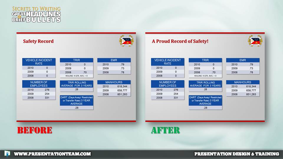
Headlines are the high-level story of the presentation. In business presentations, executives often scan the presentation for keywords and takeaway points. Well-written headlines should guide the reader along through the presentation summarizing each page, distilling the supporting bullets or detail, and weaving a compelling story. This is especially important if there’s no presenter, or if the presentation is a standalone or printed deck.
In the example above the first version (Before) has a neutral headline “Safety Record.” The updated headline is more active and summarizes the charted data and information.
Fragmented sentence headlines (“Introduction”), while easy to write, do little to hook the audience and tell the story. But it’s best to aim for full-sentences of summation in the headlines of your presentation. You may, however, wish to use fragments or key words “Intro, example 1, etc.” for presentation sections or topic slides.
Some business presentations use takeaway messages, summarizing messages usually at the bottom of a page. Try to merge the title and takeaway points; you’ll have a cleaner, more open-spacious presentation with a more focused message. Less is more.
6. Don’t repeat the headline in the body of your slide.
The text or bullets of the presentation should support the slide headline…not duplicate it! Aim to keep your bullets brief and supportive of the slide’s headline, using similar- but not identical- words.
7. Fragment your bullets
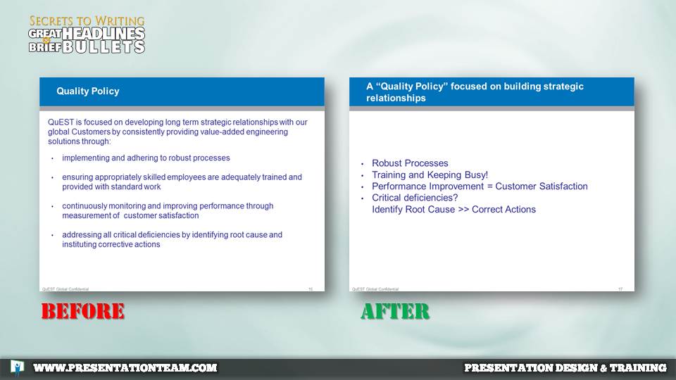
Just as we aim to write short simple sentences for our headlines, we should aim to keep our bullets simple and concise also. But, unlike the titles where a short sentence is our goal, our goal in a solid bullet is a concise sentence fragment. There’s no need for a full in-depth sentence, especially if the presentation will be delivered by a speaker.
Aim to ditch most modifiers including extra adjectives, adverbs and action words. But look for ways to say the same message in fewer words.
8. Avoid all unnecessary words that you can find to help make the page more appealing and easier to understand*.
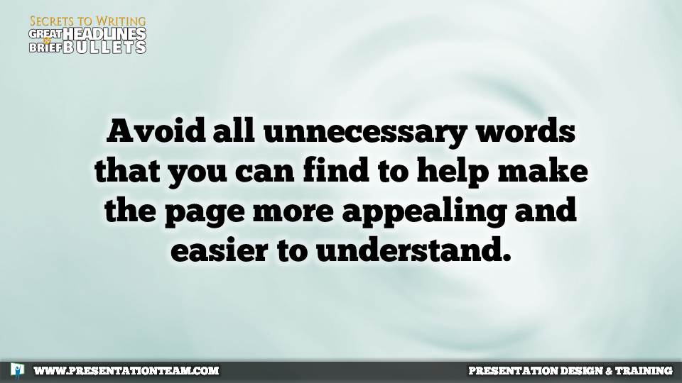
*This headline above can be edited to three words: “Avoid unnecessary words.”
Repeatedly read through the presentation with a critical eye. What can be eliminated? Merged? Restated more simply? Call on a friend or collague for assistance; eventually you’ll start writing short potent headlines perfectly.
9. No Orphans

Whenever you see one lovebird, you usually see another; these friends of a feather always flock together. Similarly, aim to avoid single-item bullets. Called “orphans” these one bullet items usually indicate another bullet is nearby. Indeed, one bullet demands a second bullet (that’s why they’re called bullets).
On single-item points, aim to combine the item with the topic/headline. Or remove the bullet symbol and keep the text as a subpoint of the main point.
“The Presentation” should not be viewed as document, but rather a graphical medium to help underscore key messages. Through regular practice of reviewing your presentation, you’ll find opportunities to trim the text and say more with less…leaving the text to the paper.
better powerpoint, bullets, headlines, powerpoint, tips, writing

